
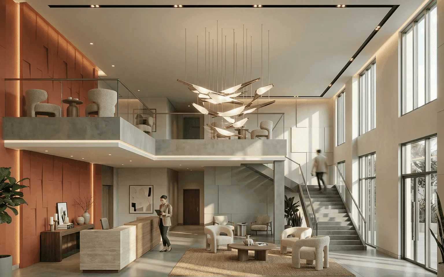
A room can look completely resolved in a shopping cart and still feel wrong when everything arrives. The sofa is deeper than expected, the rug suddenly looks small, the paint is cooler under the actual window light, and the side table that seemed delicate online feels bulky beside the chair. AI room design can help people test some of those relationships visually before they spend money, but it works best as an early filter rather than a replacement for measurements, samples, or professional planning.
That is an important difference. Visual tools are good at helping people imagine. They can show whether a darker wall might suit the room, whether the overall style is becoming too busy, or whether a pale palette needs more contrast. They are much less reliable for questions that depend on exact dimensions, product specifications, or construction. A useful workflow knows when to stay visual and when to reach for a tape measure.
Start With the Biggest Commitment
Not every choice deserves the same amount of testing. A cushion can be returned. A custom sofa, new flooring, or built-in storage is a much bigger commitment. Start with the decisions that are expensive, slow, or difficult to reverse. If those relationships feel right, smaller decorative choices become easier because they have a stable background to work against.
This is where room redesign AI can be genuinely helpful. A designer or homeowner can explore several broad directions without buying samples for every idea. The visual might show that a dark green sofa gives the room enough weight, while a beige one makes the entire scheme feel washed out. That does not finalize the purchase, but it narrows the field.
Use the Existing Room, Not an Imaginary One
It is easy to get carried away with reference images that have different ceiling heights, window sizes, and architectural character. A style that looks effortless in a large loft may feel cramped in a small apartment. Starting from the actual room through photos, sketches, or a simple model keeps the test honest. The design has to work with the space that exists, not the one in the inspiration folder.
Platforms such as dsgnr support this kind of visual exploration from existing project material. The value is not that the platform knows what the client should choose. It is that the designer can make an idea visible in context, compare it with another direction, and decide whether it deserves more detailed development.
Check Color in More Than One Light
Color is one of the easiest things to misread on a screen. A warm white can look grey under northern daylight. A timber can pick up orange tones in the evening. A dark blue wall may feel sophisticated in a render but almost black in the real room after sunset. Visual tests are useful, but physical samples still matter because screens and generated images cannot reproduce every lighting condition accurately.
A sensible process uses both. Try the broad color relationship visually, then order or paint samples of the leading options. Look at them in the morning, afternoon, and under artificial light. The digital step saves the client from sampling ten unrelated ideas. The physical step prevents the final choice from being based on a screen alone.
Leave Enough Space Around Furniture
Furniture decisions are often made by width, but depth and circulation are just as important. A large sofa may technically fit on the wall while leaving the coffee table too close. Dining chairs need room to pull out. A bed needs practical space around it, not just a gap in a plan. These relationships are difficult to judge from a styled image unless the underlying dimensions are accurate.
For that reason, use visual redesign to judge proportion and mood, then confirm the layout with measured drawings or taped outlines on the floor. Masking tape is not high technology, but it remains one of the fastest ways to understand how much space a large object will occupy. A strong design process is happy to use both sophisticated visualization and simple physical checks.
Stop Before the Image Becomes a Shopping List
Generated room images often include attractive objects that were never selected for the project. A client may ask where to buy the lamp in the corner or assume that the exact chair shown is part of the proposal. Designers can avoid this by being clear about what the image represents. If it is a style study, say so. If certain products are placeholders, label them as placeholders.
This keeps the visual useful without creating accidental promises. Once the major direction is approved, the team can replace generic elements with real products that fit the budget, lead time, dimensions, and performance requirements. The final scheme becomes more specific as the project becomes more certain, rather than pretending to be specific from the first image.
Use Real Product Information Before Final Approval
Once a visual direction is working, the next step is to replace generic ideas with real products. Check the actual sofa depth, fabric composition, rug size, bulb output, lead time, and return policy. A rendered object may only represent a category low armchair, pale oak table, textured pendant while the product eventually purchased has its own proportions and behavior. That difference becomes important as the project moves from concept into ordering.
Designers can keep the transition clear by updating visuals only when the product choice materially changes the room. There is no need to rebuild an image for every small accessory, but a much deeper sofa or a darker stone deserves another look. The visual then remains connected to the decisions that carry real cost, rather than becoming a decorative record of every item on the schedule.
Conclusion
Visual room tools can be a practical way to avoid expensive false starts. They help people compare broad directions, see color and material relationships, and understand how a large furniture choice might change the character of a room. Used early, they can make shopping and client discussions more focused because fewer decisions are being made entirely from imagination.
They work best when paired with the ordinary checks that good interiors have always required: real measurements, physical samples, product information, and clear decisions about what the image does and does not represent. Test the idea visually, verify it in the real room, then commit. That sequence is far safer than treating a convincing image as a guarantee.